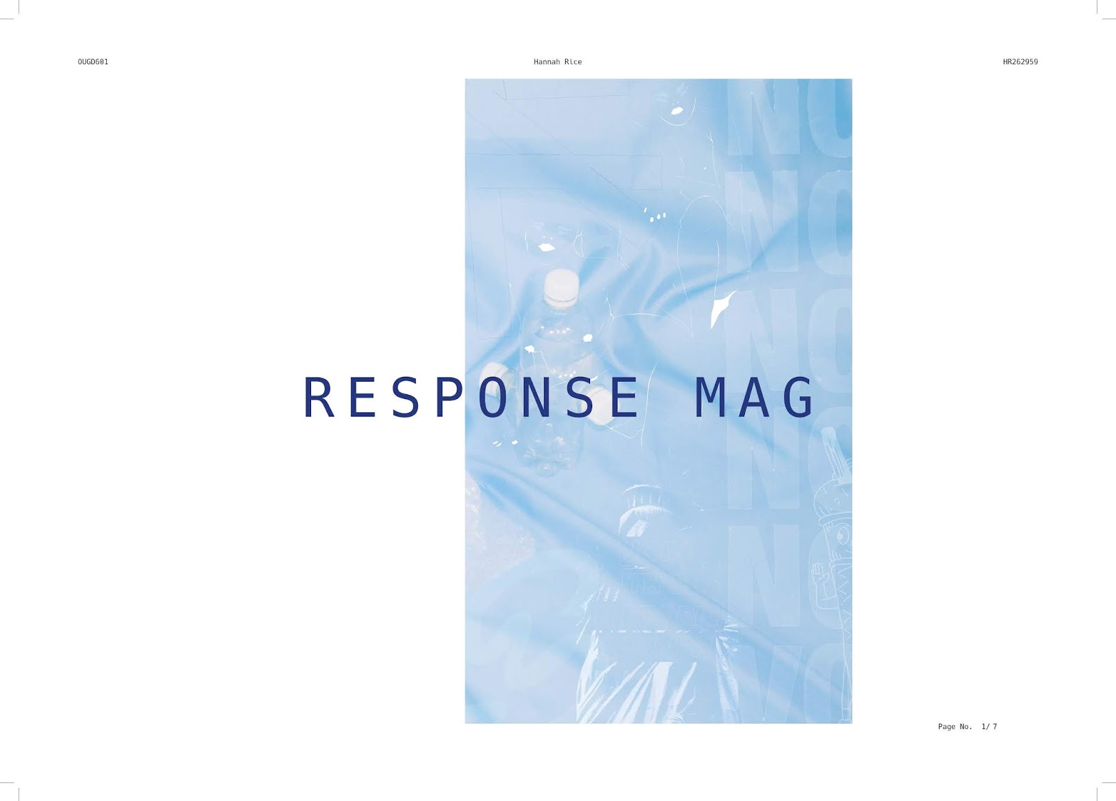
The
magazine celebrates the work of designers who have produced socially driven
design outcomes and in responds to the idea of content driven design. In order
to remove any gender associations within design that may influence the gender
inequality, the magazine does not reveal the designers name until the back
page. This allows for all attention to be on the actual work and designing in
response to the content rather than following a uniformed design system has
allowed for any associations to gender to be removed. The final outcome was
informed by a lot of research so as a result will engage the intended target
audience and work on removing all attention away from the gender gap and work
to remove the inequality. In order to develop this project further, more time
for experimentation into the ways in which all gender associations could be
removed as there are still small hints of it within the magazine.
Tuesday, 18 December 2018
Magazine - Photography


Essay - Library loans
These were the initial books that I took out form the library so that I could start to really ready around the subject in terms of design rather than the gender inequality itself.
Title: The theory of advertising: a simple exposition of the principles of psychology.
Author: Scott, William Dill
Classification: 659.101 SCO
Barcode: R67798N0084
Date due: 26/11/2018
Title: So you want to publish a magazine?
Author: Lewis, Angharad - 1
Classification: 659.101 LEW
Barcode: R95429W0084
Date due: 26/11/2018
Title: Advertising is dead, long live advertising.
Author: Himpe, Tom
Classification: 659.1 HIM
Barcode: R69527W0084
Date due: 26/11/2018
Title: Just my type: a book about fonts.
Author: Garfield, Simon - 5
Classification: 655.2
Barcode: R77339W0084
Date due: 26/11/2018
Title: The type taster: how fonts influence you.
Author: Hyndman, Sarah
Classification: 655.2
Barcode: R85199A0084
Date due: 26/11/2018
Title: Type matters!
Author: Williams, Jim
Classification: 655.2
Barcode: R75278W0084
Date due: 26/11/2018
Title: Typography sketchbooks.
Author: Talarico, Lita; Heller, Steven
Classification: 655.2
Barcode: R78030W0084
Date due: 26/11/2018
Title: Getting it right with type.
Author: Willberg, Hans Peter; Forssman, Friedrich; Squire, Victoria
Classification: 655.2
Barcode: R51969X0084
Date due: 26/11/2018
Title: Thinking with type: a critical guide for designers, writers, editors and students.
Author: Lupton, Ellen
Classification: 655.2
Barcode: R95414K0084
Date due: 26/11/2018
Essay - Final feedback
A final tutorial with my tutor on a draft that was almost completed was really useful We sat and spoke about the essay section by section on ways to ensure that I was directly linking everything that I was saying to the essay question. The need to turn the title into a question became apparent and rather than working from a statement, I am now at a point where a question can really be developed to ensure that the content is very focused and all appropriate.
I used the comment feature on Microsoft word so that as we sat and went through it section by section, I could make note of everything that we discussed, ensuring that the tutorial was put to best use in order to improve the essay ready for print. I found it really useful to sit and discuss the different sections with my tutor because it made it clear if I was not hitting the exact point I wanted to if someone else didn't fully understand what I was meaning to say.
I can now take these comments and continue to develop my final dissertation.


Ethical considerations
As part of the module, I was made more aware about the ethical considerations that are needed when conducting primary research. I considered the ethics that should be involved when interviewing someone, so began to look over the Universities policy on ethical proceeds. The interview that I did with the designer Eike Koenig was email based and by receiving a reply, I am able to assume that the participant agrees to the information being part of the magazine content.
The form provided also states that the participants who are involved in the research must fill out the form, but as this isn't for research and is for the magazine content itself, the form becomes irrelevant as the designer was no longer participant and actually just a contributor.

The form provided also states that the participants who are involved in the research must fill out the form, but as this isn't for research and is for the magazine content itself, the form becomes irrelevant as the designer was no longer participant and actually just a contributor.

Magazine - Test Run + feedback
As I was printing externally, I did not need to mock the magazine up to check the production methods but the content and overall design quality did need to be checked in order to ensure that when sent off to the printing company it would work as intended. I printed it out to scale, just not full bleed so that I could get peers to help me go through and find anything that needed to be changed.
I first got someone to proof read all of the writing as with a fresh set of eyes, more would be picked up. Here are some examples of what was found to be changed:


I then got together a group of peers to each go through the magazine and see if there were any design changes that they would personally make. They were marked on the printed mock up so that I could go through and have record of them all to change my design on InDesign. Here are some of the changes that were noted:


I first got someone to proof read all of the writing as with a fresh set of eyes, more would be picked up. Here are some examples of what was found to be changed:


Project Statement
The exploration of editorial design challenging the gender gap and inequality in the design industry has revealed that there are many gender associations that have been constructed over the years, in particular design movements and theories. Michael Spondé states that ‘anyone who wanders through the classes of our art academies is surprised by the high percentage of women among the students’ (Meer. J, 2018) which does not reflect the current creative industry which is shown to have only 11% of creative directors as women. The idea that the design decisions used within editorial design to challenging this gender gap and inequality was a link made based on the idea that Graphic Design can act as the communications framework through which these messages about what the world is and what we should aspire to’ (Hustwit. G, 2007).
The editorial design work of Cipe Pineles really pushed the idea of content consideration as communication and managed to steer away from the overriding male dominance within the industry by responding against the patriarchal, modernist design. The breaking of boundaries seen in the post-modern movement was an opportunity to break free from the supposed confines of the modern movement, in the creation of a new form of visual expression.
Upon exploration, it is clear that editorial design decisions need to ultimately be neutralised in order to remove any of the gender associations that have been socially constructed within the different design movements as discussed. Editorial design decisions took a focus on spotlighting issues and positively portraying the intelligence of women across the disciplines and elements such as the typeface and colour choice have been shown to effectively communicate in a much more powerful manner through the use of associations that have been socially constructed over the years. Editorial design as a platform to focus on the design work rather than gender will effectively continue to portray a sense of equality between the genders and hypothetically eliminate the attention towards female designers and work towards a better level of equality within the creative industry.
In response to the written piece, it concluded that over the years there have been some obvious gender focused design styles within editorial and although the issue of the gender inequality within the design industry has been raised as an issue and influencing in terms of communicating the issue has occurred, but it still isn’t necessarily the most effective way to narrow the gap. The practical project was a magazine designed in response the quote about Cipe Pineles: ‘She didn’t teach style – she taught content. She taught you to start with the content of the magazine and then world from there, rather than just think about what design was going to look nice on the page.’ – Melissa Tardiff. In order to remove any gender associations within design that may influence the gender inequality, the magazine will focus on not revealing the designers name before the name of the project and all of the work within will be visually represented in the style of the designer rather than the visual identity of the magazine. The idea of the design being driven by the content within rather than following a uniformed design system will appropriately remove any associations to the particular design styles in regards to gender.
Magazine - Production
Design

Outcome:
I am happy with the outcome and it is of a high quality.

The design process for the magazine was completed through the use if the Adobe Creative Suite as it allowed for content manipulation and consistent layouts throughout the full editorial. Adobe Illustrator was the main programme used for the design work as it uses vectors which means that the quality of the print will not be changed if enlarged in size. The typeface experiments took place using this software and then any effects such as overlaying or opacity changing was completed using Adobe Photoshop. The artwork for the front cover of the magazine was made using Adobe Photoshop, the different elements were cut out using the magnetic lasso tool and then the blending options were used in a variety of ways to create the final texture that will be used on the front cover.
Print
The research into design magazines was based on those that were included in my essay and then looking on websites such as https://villagebooks.co to see the most common way that the magazines were bound. In terms of the binding method, I found that they were perfect bound and it seemed that methods such as stitching or stapling was for publications such as zines. The finish of the front covers were all of a paper stock varying from around 200gsm - 350gsm which is something that I would need to consider for the design of my magazine. The finish of most of the front covers were matte rather than glossy which seemed to be the big difference between a more mainstream magazine and a design editorial. If printed externally, this finish could be achieved through the use of matte lamination. The front cover would be printed onto silk paper and then the final process would be the matte lamination to give it the same aesthetic as those existing.
This research has informed my production process and made me realise that to achieve the standard of finish that I am hoping for I will need to use the service of an external printing company. The number of pages in my magazine would mean that perfect binding with the university resources would be possible, but there is a high chance that the pages with time will come out of the spine. In order to achieve the matte lamination of the front cover this will have to be done externally as well, so if in industry an outside company would be sent the finalised designs to then produce the magazine.
The research then continued onto to finding the printing company to use for the magazine. I decided to choose one based on a recommendation from another design student as it allowed me to feel confident that the final outcome will be of a high quality and be delivered on time. The printing time externally is much longer than if I was to print within University, so taking this into consideration I had to plan my design time well so that I could do a full set of developments and run a prototype print of the magazine before it needed to be sent for print.
Print deadline: Friday 7th December
Print deadline: Friday 7th December
The one complication of printing externally is that each printing company has individual guidelines on how they want the pages to be uploaded. I used the instructions on the website to set the Adobe Indesign document for print. The pdf had to be in the format of {PDF/X-1a:2001} (modified) which is something different to what I had previously exported a pdf as. The bleed needed to be set to 3mm for any full bleed page and the crop marks needed to also be included on the pdf so that the magazine could be accurately cut to the correct size.


Complications
A problem with ordering online is that you do not have the personal service or contact available if there are any confusions or complications. I had a lot of trust in this company as others had recommended it to me for the quick service and high quality printing service. To receive an email after the hours that the office was open to say that there was a complication with my order and that they would not be able to meet the deadline of my printing was very much a shock. I had very closely followed all of the uploading guidelines to ensure that there were no problems with the printing of the magazine.


I had to start thinking of other places to get it printed within the now very short time frame before the final hand in. I found a number of different printing places in Leeds and London that I could contact in the morning if things did not go well with this company.
I called at 8am the next morning to find out what the problem was and the man I spoke to could not understand why I had been sent this email. It was because the content within does not all read from top to bottom as it is a design magazine and perhaps a bit more experimental than they are used to. The problem was resolved and I was sent the magazine the next day. In order to prevent this in the future, I will call the company after I have uploaded the files just to ensure that they are accurate and that there will not be any problems when it comes to printing.

I am happy with the outcome and it is of a high quality.

Subscribe to:
Comments (Atom)